I grew up on Sierra games. King’s Quest, Space Quest, Quest for Glory—if it had “Quest” in the title and VGA graphics, I was there. Those games taught me that peak visual design was achieved sometime around 1992 and everything since has been a lateral move at best.
So when I decided to redesign my blog, naturally I thought: what if my website looked like a point-and-click adventure game? What if my cat Ramona wandered across the screen? What if there were multiple themes and weather effects and a Konami code easter egg?
What could possibly go wrong?
 ## The Diver Incident
Here’s the thing about having ADHD and access to AI art tools: every idea feels like the best idea until it isn’t.
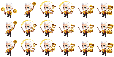
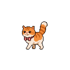
I started this project with a diver sprite. A little 96x96 pixel diver who would swim across the page. Made sense at the time—I went to commercial diving school, I have a connection to the ocean, it’s thematic.
Except it wasn’t. It was weird. Why is there a diver on a fantasy cottage blog about my hobbies and medical adventures? I scaled him down to 48x48. Still weird. I tried different animations.
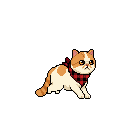
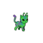
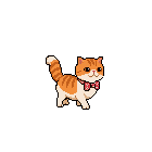
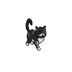
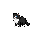
Then I looked at Ramona sleeping on my desk and thought: oh. It should just be my cat.
Forty-seven sprite animations later, Ramona now walks, runs, jumps, yawns, sleeps, cleans her face, and wakes up—all in 8 directions. The diver files still exist in the repo like a reminder of my hubris.
 ## The 336-File Reorganization Commit
When you’re building something with Claude Code and Pixellab, the assets accumulate fast. Really fast. At some point I had files everywhere—sprites mixed with headers, fantasy assets next to cyberpunk ones, and a naming convention that could charitably be described as “vibes-based.”
The commit message for the fix was just: “Reorganize all assets into theme folders.”
336 files. One commit. The git diff was a nightmare.
But now everything lives in tidy folders: /fantasy/, /sci-fi/, /cyberpunk/, /cabin/, /underwater/. Each with their own headers, sprites, backgrounds. It’s beautiful. It only took me three days of chaos to get there.
The PNG Problem
You know what’s heavy? PNG files. You know what I had? Hundreds of them.
The cyberpunk theme alone was 60+ megabytes before I figured out WebP conversion. The fantasy theme was worse. I was essentially asking visitors to download a small video game before they could read my posts about ankle surgery.
The fix was simple: convert everything to WebP. The result was dramatic—cyberpunk dropped to 12MB, the whole theme package became manageable. The lesson was the same one I keep learning: the obvious solution is usually the right one, I just have to fail my way to it first.
168 Lines of CSS Attribute Selectors
Here’s where it gets fun. I have 5 themes. Each theme has custom category header images. There are ~34 categories. Do the math.
The theme switcher doesn’t use JavaScript to swap images—that felt too heavy. Instead, I wrote CSS that looks for the header image in the style attribute and overrides it per theme:
html.theme-cyberpunk .header-image[style*="health.webp"] {
  background-image: url("/cyberpunk/headers/health.webp") !important;
}

html.theme-cyberpunk .header-image[style*="tech.webp"] {
  background-image: url("/cyberpunk/headers/tech.webp") !important;
}

/* ...repeat 166 more times */
Is this elegant? No. Does it work without any JavaScript overhead? Yes. Am I proud of it? Also yes, in a chaotic goblin kind of way.
The Note Scroll Saga
I wanted notes (my short posts) to look like little scrolls. Seemed simple: a scroll top, a repeating middle section, and a scroll bottom.
Four iterations later, I had learned:
- Scrolls need to work in both day AND night mode
- Mobile rendering is different than desktop
- “Disappeared behind” is not a valid display state
- Session storage and local storage are different things and I should know which one I’m using
The scroll system now works beautifully. It only took… let me check the git log… seven commits to get there.
What Actually Worked
Not everything was a disaster. Some things came together like magic:
The Sierra Control Panel - A little dropdown menu at the top that lets you toggle day/night, weather effects, themes, and chaos mode. It feels exactly like clicking on the menu bar in an old Mac game.
Ramona’s AI - She wanders the page on her own, occasionally sitting down to yawn or clean her face. When you scroll, she follows. On mobile, she hides because she knows small screens need the space.
The Achievement System - 25+ unlockable achievements for exploring the site. Find the Konami code? Achievement. Click the theme button 25 times? You unlock chaos mode AND get an achievement.
Chaos Mode Itself - After enough engagement, the site goes full chaos goblin: floating pixel sprites, particle effects, screen shake, CRT scanlines. It’s ridiculous. I love it.
The Tools That Made This Possible
I built this entire thing with Claude Code as my coding partner. Every late-night debugging session, every “why doesn’t this CSS work” moment, every time I needed to refactor 336 files—Claude was there, probably judging my variable naming choices.
The pixel art sprites came from Pixellab, which let me generate Ramona in all her 8-directional glory without having to learn actual pixel art (though honestly, I might now—it’s kind of addictive).
The Lesson (If There Is One)
I’m not sure this project taught me anything I didn’t already know. I’m going to start projects without a clear plan. I’m going to make weird decisions that I have to undo later. I’m going to write 168 lines of CSS attribute selectors because it seems like a good idea at 2am.
But I’m also going to end up with a blog that looks like a 1992 Sierra game, with my actual cat walking across the screen, and weather effects, and a chaos mode that rewards people for sticking around.
VGA graphics really were peak.
Stay pixelated, friends.